
With AdaptiveCards 1.3 (also 2.1.0 ) cards got a relatively simple but really powerfull change. All input fields now have a new property called “label”
Yea…a new field label but how does this make cards simpler?
Pretty simple. Take this card , made with AdaptiveCards 1.2:
{
    "type": "AdaptiveCard",
    "$schema": "http://adaptivecards.io/schemas/adaptive-card.json",
    "version": "1.2",
    "body": [
        {
            "type": "TextBlock",
            "text": "Your Family Name"
        },
        {
            "type": "Input.Text",
            "placeholder": "Your family name...",
            "label": "Family Name",
            "isRequired": true,
            "errorMessage": "This field is required",
            "id": "familyname"
        },
        {
            "type": "TextBlock",
            "text": "Your Name"
        },
        {
            "type": "Input.Text",
            "placeholder": "Placeholder text",
            "label": "Your first name...",
            "id": "firstname"
        },
        {
            "type": "TextBlock",
            "text": "Date of Birth"
        },
        {
            "type": "Input.Date",
            "isRequired": true
        },
        {
            "type": "TextBlock",
            "text": "Email"
        },
        {
            "type": "Input.Text",
            "placeholder": "[email protected]",
            "id": "email"
        },
        {
            "type": "TextBlock",
            "text": "Password"
        },
        {
            "type": "Input.Text",
            "placeholder": "Placeholder text",
            "id": "pwd"
        }
    ],
    "actions": [
        {
            "type": "Action.Submit",
            "title": "Sign Up"
        }
    ]
}
Notice how I said “simple” and you had to scroll all the way through the looong JSON Code? In fact, this card is pretty simple when we look at the rendered card:
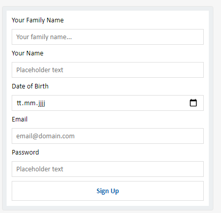
However, to build the card we had to do a lot of things, and for every input we needed 2 AdaptiveCard Controls. An Input.Text and a Textblock.
Now, lets compare things and have a look at the exact same card, made with Adaptive Cards 1.3:
Wow….thats a lot less JSON Code than what we had before isn’t it? In fact its half the amount of controls needed to get the exact same result as before.
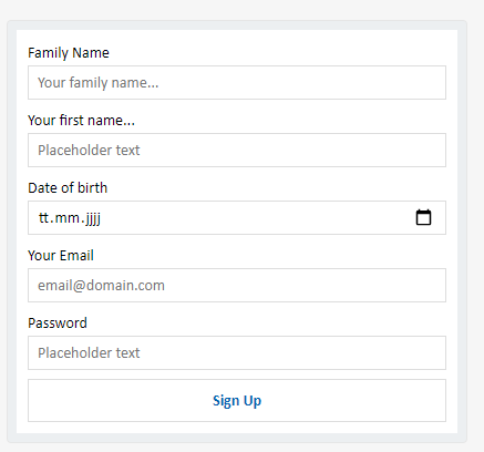
With AdaptiveCards 1.3 every Input has a “Label” property, this property automatically renders the text label above the input and you no longer have to do that yourself. You still can, if you want to tho. But this effectively means that you in many many cases only need half the controls to get the same card result. Thats already great isn’t it?
But thats not all of the great news!!!
Client Side Input Validation!
Yes, thats right, you’ve read it right. With AdaptiveCards 1.3 there’s now input validation on all input fields. You can now do things like making sure people can only enter valid emails or specific range dates etc pretty much anything you can do with either min/max or regex can be done.
Using the input validation is pretty simple. Take a look at this part for example:
A simple “Input.Text” but its validated against regex making sure the password entered follows specific rules. In this case 1 lower char, 1 upper, 1 special and minimum 8 chars required.
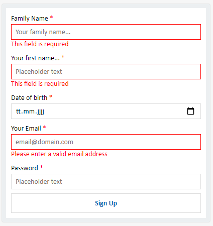
Additionally you can add a custom error message when validation fails. You can try the actual working card here: simple-signup-form-with-validation
So what exactly can I do with this?
Well, you can validate all inputs a user does on any given AdaptiveCard, some examples but not limited to are:
- Validating text fields based on regex, anything you can do with regex, you can validate.
- Validating Dates, ie requiring a min or max date value on fields
- Numeric limitations, max number 1000? yea go for it.
- Enforce specific formats. You want the user to input something in a spefic format like emails, zip codes or generally something like “no spaces”. You can do this now aswell.
- and much more….
All validations happen on clientside before the actual card is submitted to the server.
That said have a look at www.madewithcards.io/cards we have some 1.3 and input validation samples there aswell.
You can get the new AdaptiveCards version from Nuget or NPM as usually but should consider installing 2.1.0 or 2.0.0 which is a new version fully backwards compatible and includes all the new features.